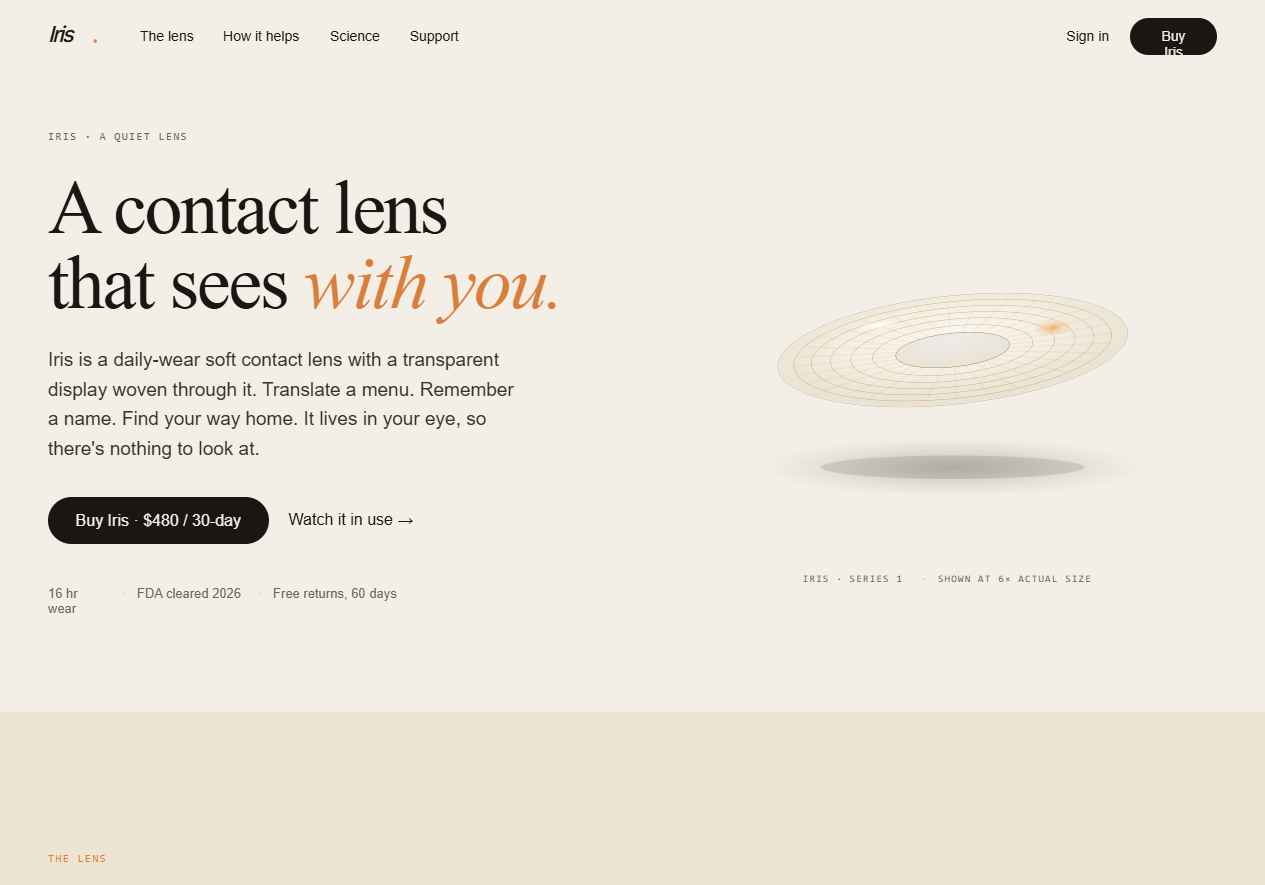
Iris · Integrated Reality Contact Lenses
A self-initiated consumer AR product and the design system behind it. A daily-wear soft contact lens with a retinal micro-projector, an outward camera, and an on-device AI that lays contextual help over your field of view: translations, directions, what's-that-plant, where-did-I-put-my-keys.

Product thesis
Grounded in 18 interviews with daily contact wearers. The dominant ask wasn't more features; it was less friction. "Stop making me pull out my phone." "I don't want to look like a dork." Iris was shaped by those two constraints: fade into the background, and only speak when it has something useful to say. One color per eye, thin linework, tight typography: the constraint is the signature.
Iris Product Marketing
The place people learn about Iris and buy it. An editorial serif sets the tone for a category that usually reads as bro-tech. Warm paper palette, amber accent used sparingly, a quiet product hero rendered at 6× actual size because the real thing sits in your eye.
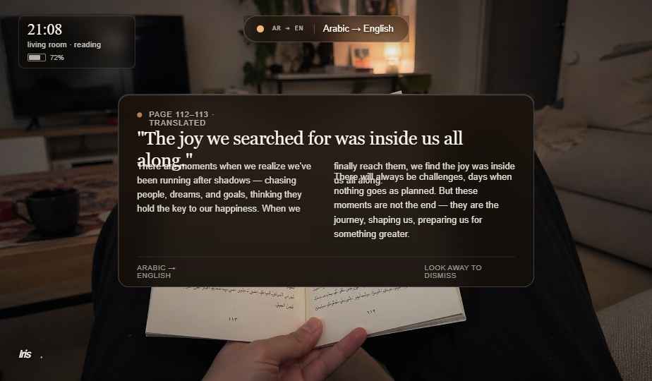
AR HUD
The flagship surface, what you see through the lens. Monochromatic warm white over real-world video. A persistent five-mode switcher (Identify, Translate, Navigate, Remember, Quiet) anchors the system; everything else appears only when it has something to say. The "Quiet" mode is the honest one: most of the time you want the lens to be invisible.
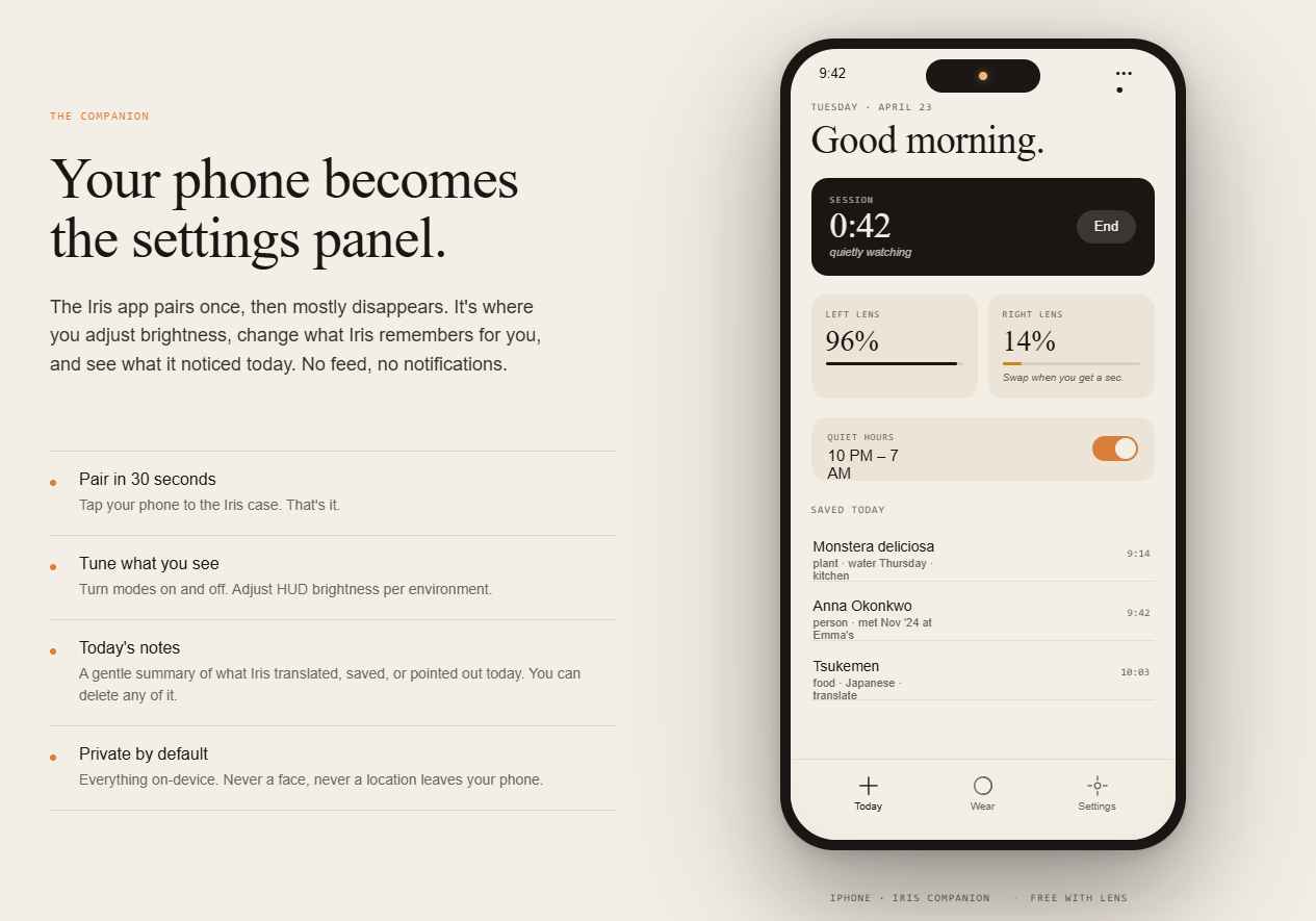
iOS companion app
Pairing, preferences, wellness metrics (wear time, blink rate, eye strain), and billing. The Today screen reports the current session with dignity: lens battery, quiet hours, and what you saved today, without the gamified streak nonsense that would undermine the calm posture of the product.